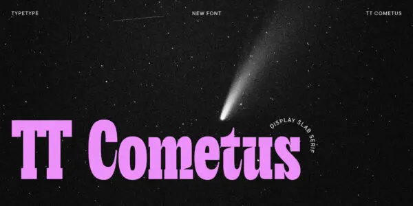
In the digital age, where the written word is disseminated with lightning speed across screens of all sizes, typography plays a pivotal role in shaping the way we perceive and interact with content. Amidst the myriad font choices available, serif fonts stand as stalwarts of timeless elegance and clarity. In this article, we embark on a journey through the enchanting world of serif fonts and discover why they continue to be a favorite among designers and readers alike.
The Birth of Serifs: A Historical Prelude
The history of serif fonts can be traced back to the cradle of typography—the ancient civilizations that first experimented with written language. The word “serif” itself is derived from the Dutch word “schreef,” which means “line” or “stroke.” The distinctive feature of serifs is the small lines or strokes that adorn the ends of characters, creating a sense of refinement and structure.
Serifs made their grand debut in the Roman Empire, where monumental inscriptions chiseled into stone showcased these elegant letterforms. The timeless Roman typefaces, including the iconic Times New Roman, are the descendants of this classical heritage.
The Serif Aesthetic: Classic and Readable
Serif fonts are celebrated for their classic, dignified appearance. The serifs, with their delicate curves and lines, create a sense of order and harmony in the text. This classicism is why serif fonts are often associated with tradition, authority, and formality.
But elegance doesn’t come at the cost of readability. Serif fonts are exceptionally legible, especially in printed materials. The serifs guide the eye along the text, making it easier to follow lines of words. This readability is one reason serif fonts are preferred for books, newspapers, and lengthy documents. They create a smooth reading experience, allowing readers to engage with the content without unnecessary distractions.
The Versatility of Serif Fonts: From Print to Digital
While serif fonts have a strong presence in the world of print, they are by no means confined to it. The adaptability of serifs shines through in their use across various mediums. In the digital realm, serif fonts are employed to convey a sense of sophistication and authority. They are often seen in websites, blogs, and digital publications where a touch of classic elegance is desired.
Serif fonts also play a significant role in branding. Many renowned logos and corporate identities, such as BMW and The New York Times, feature serif typefaces. The choice of serif fonts in these contexts communicates trustworthiness, heritage, and a commitment to quality.
Modern Takes on Timeless Classics: Serif Fonts in Contemporary Design
The beauty of serif fonts lies in their ability to blend tradition with modernity. Contemporary designers often rework classic serif typefaces, infusing them with a fresh, current aesthetic. These modern serifs retain the elegance and readability of their ancestors while adapting to the demands of today’s design sensibilities.
Whether it’s the subtle sophistication of Georgia, the contemporary charm of Baskerville, or the crisp professionalism of Garamond, serif fonts offer a rich palette for designers to choose from. Each font has its unique character, and selecting the right one is akin to choosing the perfect outfit for a message.
In Conclusion: The Enduring Allure of Serif Fonts
In a world of ever-changing trends and fleeting fashions, serif fonts stand as enduring classics. They are the sartorial elegance of typography, the black-tie attire of the written word. Whether on the pages of a cherished book, the screen of a website, or the masthead of a newspaper, serif fonts continue to weave their spell of timeless beauty and readability. In a digital landscape marked by constant transformation, serifs remain a steadfast symbol of grace and distinction.


